Talk:Théodore Géricault
| This It is of interest to the following WikiProjects: | ||||||||||||||||||||||||||||
| ||||||||||||||||||||||||||||
| A fact from this article was featured on Wikipedia's Main Page in the On this day section on September 26, 2018. |
English sporting art[edit]
What is "English sporting art?" --sparkit (talk) 22:56, May 7, 2005 (UTC)
- Sporting art is art that features traditional outdoor sporting activities such as fishing, horse racing, and fox hunting. It was particularly popular in England in the nineteenth century. Indrian 23:09, May 7, 2005 (UTC)
"Aunt"[edit]
The aunt in the English version is said to be a slightly different relative in the French article. —Preceding unsigned comment added by 86.139.51.30 (talk) 10:27, 10 April 2009 (UTC)
Superior images[edit]
I have changed a couple images back after I was reverted.
-
Théodore Géricault - L'Aliéné.jpg Poor colour, sharpness and resolution
-
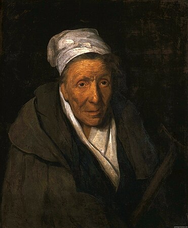
Théodore Géricault - Portrait of a Kleptomaniac - WGA08636.jpg Correct colour, sharper, higher resolution
-
GericaultMonomaniacOfGame.jpg Poor colour, sharpness and resolution
-
A Madwoman and Compulsive Gambler 1822 Theodore Gericault.jpg Correct colour, sharper, higher resolution
(Hohum @) 18:32, 3 February 2015 (UTC)
- You're supposed to start the Talk discussion first. I've already reverted back. You have a better case with the first image, of the man. The second pair shows a too-dark image on the right, as well as rather reddish skin, as opposed to a too-busy, and maybe too light image on the left. Of course, at thumbnail size, as most viewers will see them, both of your preferred images appear too dark and indistinct. Dhtwiki (talk) 09:21, 4 February 2015 (UTC)
- On my carefully calibrated screen I can see detail in the dark areas just fine. I beleive the original images have dark backgrounds, so the images I was using would be superior. Your preferred images show people with yellow skin, which is ridiculous, and a lack of detail once the thumbnail is clicked on - which is the point of using the best version available, not just one that you like as a thumbnail. (Hohum @) 17:55, 4 February 2015 (UTC)
- I agree with Hohum on the man, and with Dhtwiki on the woman. In my recollection the latter painting looks very much like the framed image on the Louvre website. She's not yellow but not terra cotta red fading into blackness either. The lighter image is not great but more closely approximates the overall effect. It is likely that the majority of readers will see only the thumbnail, and if the thumbnail obscures most of the image even fewer will be tempted to click on it. Ewulp (talk) 03:12, 5 February 2015 (UTC)
- Let's have the newer image for the man, then. It is closer to the Ghent museum's online image, as well. The current portrait of the woman is closer to the Louvre's online portrait, yellow skin and splotchy background and all; and that portrait is the only one of the two where the newer version realizes much gain in resolution. Another editor has thoughtfully increased the image size for the pictures, which should help. Dhtwiki (talk) 10:14, 5 February 2015 (UTC)
- geez, I agree myself as an artist, & architect for over 30 years, I am now 62. The 2nd image of man is crisper and more accurate. Géricault painted "dark" around the figures , not unlike the Dutch masters paintings using a fire ground single source of light to add 3d to shade,shadow & bring the figure more to life!
- I for those exact reasons completely "disagree " about your choosing the 1st image of the mad woman who looks sickly ill with green face, which is NOT even close to the actual painting! The 2nd inage is again crisp, clear, a "bit" too dark but much more accurate than a green face! 2601:243:2600:6FD4:1D5F:FBAA:BC1F:EE7E (talk) 23:52, 7 March 2024 (UTC)
- Let's have the newer image for the man, then. It is closer to the Ghent museum's online image, as well. The current portrait of the woman is closer to the Louvre's online portrait, yellow skin and splotchy background and all; and that portrait is the only one of the two where the newer version realizes much gain in resolution. Another editor has thoughtfully increased the image size for the pictures, which should help. Dhtwiki (talk) 10:14, 5 February 2015 (UTC)
- I agree with Hohum on the man, and with Dhtwiki on the woman. In my recollection the latter painting looks very much like the framed image on the Louvre website. She's not yellow but not terra cotta red fading into blackness either. The lighter image is not great but more closely approximates the overall effect. It is likely that the majority of readers will see only the thumbnail, and if the thumbnail obscures most of the image even fewer will be tempted to click on it. Ewulp (talk) 03:12, 5 February 2015 (UTC)
- On my carefully calibrated screen I can see detail in the dark areas just fine. I beleive the original images have dark backgrounds, so the images I was using would be superior. Your preferred images show people with yellow skin, which is ridiculous, and a lack of detail once the thumbnail is clicked on - which is the point of using the best version available, not just one that you like as a thumbnail. (Hohum @) 17:55, 4 February 2015 (UTC)
Categories:
- C-Class vital articles
- Wikipedia level-5 vital articles
- Wikipedia vital articles in People
- C-Class level-5 vital articles
- Wikipedia level-5 vital articles in People
- C-Class vital articles in People
- C-Class biography articles
- C-Class biography (arts and entertainment) articles
- Low-importance biography (arts and entertainment) articles
- Arts and entertainment work group articles
- WikiProject Biography articles
- C-Class visual arts articles
- WikiProject Visual arts articles
- C-Class France articles
- Mid-importance France articles
- All WikiProject France pages
- Selected anniversaries (September 2018)


