
Wikipedia:Featured picture candidates/Tugra Mahmuds II
Tugra Mahmuds II[edit]

a Wikipedia:Featured picture

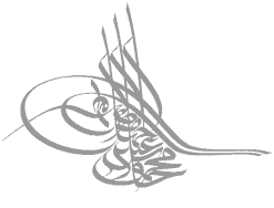
A featured image by Baba66 on the German Wiki. Illustration showing the elements used to construct a Turkish calligraphic seal, used on Tughra and Mahmud II. -- Solipsist 23:17, 22 Oct 2004 (UTC)
- Support. -- Solipsist 23:17, 22 Oct 2004 (UTC)
- Support. Wow, excellent illustration! A pity it isn't a bit larger, though the current resolution is sufficient for screen use. However, it seems incomplete. When the animation completes, there are two strokes that are still gray. According to [1], they're part of the el-muzaffer word. I think it would be difficult to add colour to those strokes without access to the original files, though, because of anti-aliasing...I'll support anyway, with that minor reservation. — David Remahl 00:03, 23 Oct 2004 (UTC)
- Oppose. I feel bad for opposing so many pictures lately, I just have high standards I suppose. --ScottyBoy900Q∞ 00:05, 23 Oct 2004 (UTC)
- Support. Was thinking of nominating this myself. -- Chris 73 Talk 02:02, Oct 23, 2004 (UTC)
- Support (see below).
Oppose because of the missing strokes noted above. It should be easy enough to fix if the original contributor is still around.Markalexander100 09:56, 23 Oct 2004 (UTC) - Strongly Support, this illustration helped me understand Arabic names.--Comrade Nick @)---^-- 10:13, 23 Oct 2004 (UTC)
Oppose - the missing strokes are anoying - I want to know the rest - support if this is fixed - sannse (talk) 11:07, 23 Oct 2004 (UTC)- Support with the new information (this should be mentioned in the caption though) -- sannse (talk) 15:19, 27 Oct 2004 (UTC)
- I put a request on the page of the german creator -- Chris 73 Talk 12:20, Oct 23, 2004 (UTC)
- Great, then hopefully we can get it in a higher resolution too. — David Remahl 04:52, 26 Oct 2004 (UTC)
- I put a request on the page of the german creator -- Chris 73 Talk 12:20, Oct 23, 2004 (UTC)
- Support. I agree with the missing strokes thing though.
- Oppose, the animation is irritating -- William M. Connolley 19:08, 23 Oct 2004 (UTC).
- Support! [[User:Neutrality|Neutrality (hopefully!)]] 03:57, Oct 24, 2004 (UTC)
- Support. Would be nice if the missing strokes could be added though. Janderk 11:21, 24 Oct 2004 (UTC)
- Oppose. If you're going to illustrate nice calligraphy, at least choose an elegant font to go with it. Garamond, perhaps. The colours aren't so good either (yellow on white is hard to read.) Gdr 13:50, 2004 Oct 24 (UTC)
- Garamond would be misleading, to say the least. Garamond is from the 16. and Mahmud II from the 19. century. During his reign the first sans-serif founts where designed in Britain so a sans-serif fits the time as well as Wikipedia's standard font settings. --217.185.10.207 21:38, 27 Oct 2004 (UTC)
- Sans-serif would be fine. All I'm asking is that it look nice! Gdr 13:16, 2004 Oct 28 (UTC)
- Garamond would be misleading, to say the least. Garamond is from the 16. and Mahmud II from the 19. century. During his reign the first sans-serif founts where designed in Britain so a sans-serif fits the time as well as Wikipedia's standard font settings. --217.185.10.207 21:38, 27 Oct 2004 (UTC)
- Oppose. I loathe animated gifs. It would be just as useful without animation, just showing the coloured version. dab 14:21, 25 Oct 2004 (UTC)
- I beg to differ, I think it is a lot clearer with animation. — David Remahl 04:52, 26 Oct 2004 (UTC)
- Strong support. Pictures in an encyclopedia are meant to explain things, and this animation does a brillant job of showing the structure in what looks like a confusing mess, within just a few seconds. Gdr, I doubt you'll find many Ottoman sultans whose tughras were in Garamond. regards, High on a tree 03:59, 26 Oct 2004 (UTC)
- Comment: I believe Gdr was referring to the bit in roman script at the bottom. Markalexander100 06:55, 26 Oct 2004 (UTC)
- Comment: I received more info from the german creator of the image:
- Die Schweife an den Hasten hatten ursprünglich nur Zierfunktion und können später, je nach Name, auch als Buchstabe alif verwendet werden, wie im Beispiel ganz rechts. Auch der linke Teil des «Fußes» wird mit Verzierungen gefüllt, wenn der Zeichenbestand des jeweiligen Sultansnamens nicht ausreicht. Aus diesem Grund bleiben in der Animation einige Linien grau. --217.185.10.205 08:40, 26 Oct 2004 (UTC).
- i.e. some of the lines had initially only a decorative function, and only later turned into part of the name. In this animation, a few of the grey-only lines fall in this group, and a few more were added only to fill up some space. -- Chris 73 Talk 11:15, Oct 26, 2004 (UTC)
- Did you ask wether he kept the original files? — David Remahl 08:05, 27 Oct 2004 (UTC)
- Thanks for that! Markalexander100 01:22, 27 Oct 2004 (UTC)
- Support. Very, very, very illustrative. -- [[User:Solitude|Solitude\talk]]
- For those who like a non-animated image, and nicer Roman text, I made the picture on the right. Gdr 00:22, 2004 Oct 29 (UTC)
- Sorry, I should have done this yesterday when I was discussing an upload of a much more usefull PDF-file with my favourite admin. Thanks for your work, hope you don't mind me overwriting it. --Baba65 11:51, 29 Oct 2004 (UTC) (someone already created User:Baba66 here without using it)
- Yes, that's much nicer. Support Baba65's version. Gdr 12:15, 2004 Oct 29 (UTC)
- Sorry, I should have done this yesterday when I was discussing an upload of a much more usefull PDF-file with my favourite admin. Thanks for your work, hope you don't mind me overwriting it. --Baba65 11:51, 29 Oct 2004 (UTC) (someone already created User:Baba66 here without using it)
- Strong support on both versions. Very very well done, I can see this took a good amount of work. Very informative. Barfooz
- Support. PMcM 21:38, 2 Nov 2004 (UTC)